Quarter Out Politics
A magazine using the state of politics in August 2020 as the source of inspiration by capturing the divisive topics of the news cycle through design.

This project is based on current affairs happening in August 2020.
I wanted to take the Quarter Out name I had for the lifestyle magazine I created, but create a version that had a serious tone. The initial working title for the cover was “The Problem in Our Politics & How to Fix It”. But as news broke of the USPS delivery scandal in August along with the continued false claims of mail-in voter fraud by the president. I adjusted the direction of the cover design away from minimalist design to one centred around the scandal.
For the design, I wanted the title to be as if someone had created it by hand with letter stamps. To achieve the natural inconsistencies of letter stamps, I chose the typeface Broadsheet for its rough and unclean design. I then individually added a stroke anywhere from 0.25 to 1.25 in size to each letter. While usually a type-crime in most cases if I wanted to achieve that look of pressure or too much ink, this is how I would do it.

The White House address and postage stamps were added then rotated to be slightly askew to create the effect they were done imperfectly by hand.
The president’s misuse of a sharpie in 2019 to alter a weather map became the inspiration for the crossed out and corrected title. I imagined the president angrily changing the title revealing the more current issue now changed to “The Money in Our Politics & How to Rig the Vote”.
Since the article was about election fraud and mail-in voting, I designed the cover to look like first-class mail from the president himself. The fragile stamp was inspired by the many Times Magazine covers that made a satirical statement about this president and meant to be a subtle comment on the perceived fragile ego of this president whose persona is based on his perceived success.


The colour was the first element I decided on when I started this design.
While I ultimately settled on red, white and blue. I briefly considered using all the colours of the Pan-African flag but felt the colours of the American flag were more appropriate for the story. The decision of setting the title in big red letters was due to the symbolic meaning behind the colour. Red not only signals to stop which speaks to “the end” in the title but it is the colour of anger and passion, which felt like an accurate way to show how many Americans have felt these past six months.

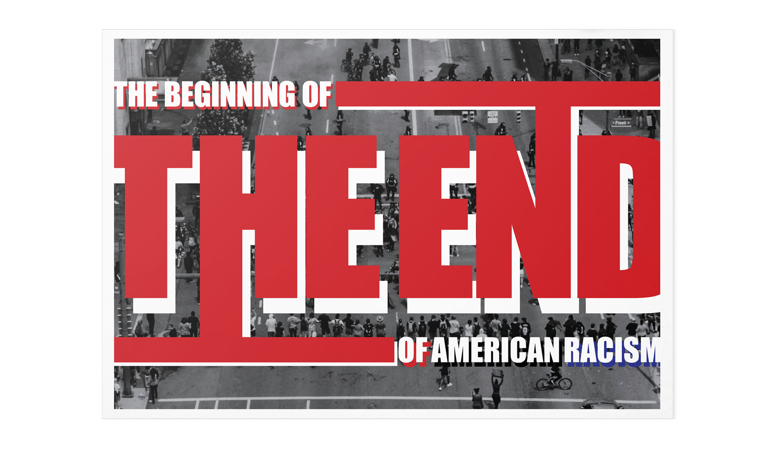
I wanted the typography to be big, in your face, and to the point that it pushed off the page.
I wanted the reader to feel the importance of “the end” to racism in America would be for the people subjected by its legacy. It also created a sense of building pressure along with a claustrophobic feeling for the literal and metaphorical suffocating nature of these issues. Because the red lettering struggled to pop off the black and white image in the background layered an off centred version behind it that is mostly in white. I then designated Americans with black and racism with blue to visually signify the ongoing struggle of police brutality for Black Americans.

I read an article about federal agencies passing information to local police about protestor activity over the summer.
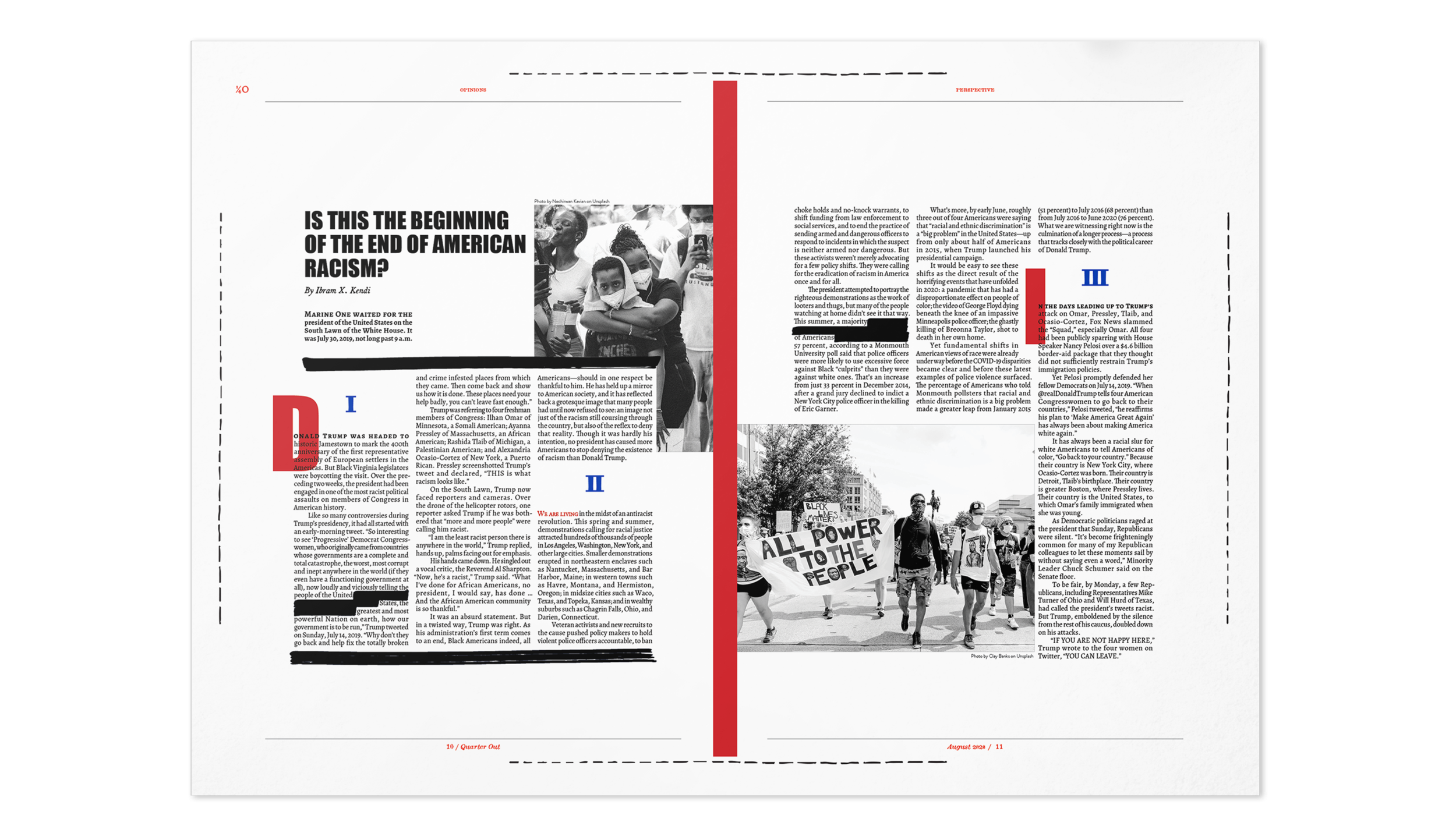
And when I read about this tactic in the news, I started thinking about the act of government redaction in documents, which gave me the idea to include it as part of the design. I first had to see how redaction could be used as a design element as it could easily confuse the reader or hinder the legibility of the article and ultimately turn into a case of style over substance.

I eventually found it could be used sparingly in some sections and then be utilized as a part of a design for pulled quotes. It’s addition allowed for the continuation of the hand-done aesthetic that was created for the cover but interpreted uniquely for this story as a visual for a systemic police effort to rewrite or downplay events and press attacks during the protests.

I achieved the look by creating a negative text wrap on the vectors so they could sit on the same baseline as the copy and push the words to the left or right out of the way instead of blocking them. While it took some time, the result received positive feedback from people as it was often the first thing to be mentioned in their review.

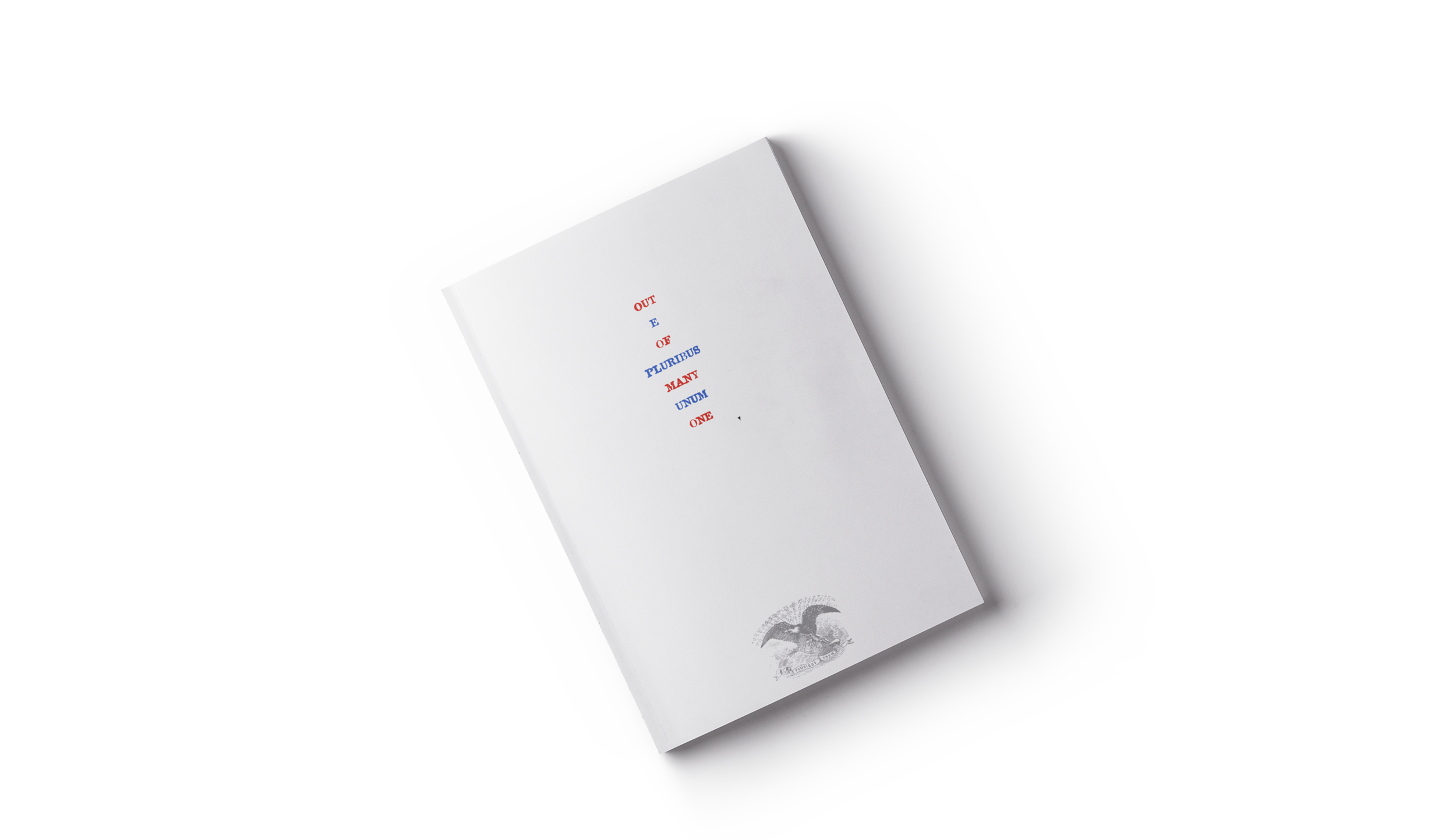
I knew for the back of the cover I wanted it to be simple and tie in with the front.
But, unlike the controversial statement of the cover story, I wanted the back to be uncontroversial but still have a message. When I brainstormed ideas for different symbols of America, like the bald eagle, I remembered discussing national mottos with a friend and both of us admiring the one America used from the beginning.
The original motto used by the United States Congress after the revolution was “E Pluribus Unum” which in English translates to “Out of Many, One”. A motto of unity perfectly summing up the new nation and a message sorely needed today.

I thought it would also be perfect to use the letter stamp design used on the front cover and an ideal message to contrast with the divisive cover story.
I placed each translation between each other one in red and one in blue, this would keep to the American themed colour story but also nod to the two political parties. Then to finish the design, I used a vintage illustration of the American seal and be the anchor for the minimal typography above it. Ultimately the combination of the two elements was designed to illicit American pride for the diverse nature of this country.
